Tuesday, November 22, 2011

Genome map

http://www.expeditions.udel.edu/extreme08/genomics/genomemap.php
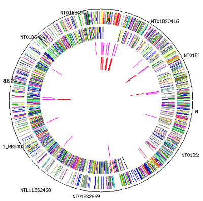
This genome map is a tool for scientist to help better track and understand an organisms genes and can provide insight into what makes it work. as well as possibly identifying which genes control what traits to better fight disease and abnormalities 

Isometric City Maps

http://shaiperednik.com/category/my-clippings/page/306/

This isometric city skyline map uses 3d technology to place buildings on a map that can than be viewed from a certain degree from above. You can find this type of city view in most video games and even on google earth. They provide an interesting perspective about the urban environment that is hard to display on flat maps.

3d view types

http://www.scriptspot.com/3ds-max/scripts/textools-toolbox-for-the-texture-artist?page=4
These different view types are ways of looking at 3d mapped projections. it is very useful to be able to switch between a wire frame object to a solid material rendering of what the shape will look like. 

Word Tree

http://improving-visualisation.org/vis/id=89
This word tree selects words and phrases and automatically shows selections that follow those words in a text . this can be used to spot trends and themes in a text. 

Thematic Maps

http://www.fas.org/irp/imint/docs/rst/Sect15/Sect15_1.html
This thematic map of south Africa focuses on labeling regions of the country that are prone to erosion. This specific geographical area is being rated on its erosion qualities giving it that certain theme.

Dot Distribution Maps

http://www.applied-epistemology.com/phpbb2/viewtopic.php?
t=117&start=450&sid=fbd06df6bdfb1c3714f2f940d6265615

I choose to use this map of England and Whales with dots plotted each representing an iron age fort. This type of map visually displays the frequency in which a certain variable is present. 

Proportional Circle Map

http://personal.frostburg.edu/mtmaier0/maps.htm

This proportional circle maps shows traffic fatalities in the US by increasing the size of the circle relative to the amount of deaths. For example it can be easy to conclude from the map that there were more deaths in Florida in 2009 than in Colorado. 

Statistical Map

http://prolifescranton.org/maps/noa.html

This statistical map compares the number of abortions  per state in the US. It uses colors to portray a certain number of abortions in a given range. There are many different kinds of statistical maps depending on the data you want to represent. 

Climbing Route Map

http://www.summitpost.org/phpBB3/do-you-look-at-the-topo-t48235.html

This is what is referred to by climbers as a topo route guide. Instead of using contour lines however it uses a 2d representation of the path needed to take along the rock in a vertical direction. It often lists distances between anchors and takes into consideration of any special gear needed for that specific route. Paired with a real picture overlay-ed with a line showing the route a climber will know exactly the way to go.

Planimetric Map

http://www.ncdot.org/doh/preconstruct/highway/photo/Products/Planimetric_maps_default.html
This planimetric map does not take in account elevation but is only a horizontal representation of a proposed highway by planned. These colored lines just distinguish what will go where and give a picture of the basic project.

Choropleth Map

http://giscommons.org/?page_id=18

A chloropleth map uses color shadings to show different area qualities based on whatever method of data or statistics being used. For example this map has 4 shades of blue that could all represent some range of numbers of exports for a certain material. 

Isoline Map

http://giscommons.org/?page_id=18

Isoline maps have continuous lines that reference differences across a surface. As you follow each line it the points along it will have equal values.


Parallel Coordinate Graph

Population Profile

http://www.investoruprising.com/author.asp?section_id=1287&doc_id=232675

This population profile shows the number of people in millions of each gender in a mirrored bar graph sorted by age brackets. It is therefore easy to see that there are the least male and females above the age of 100 and in the united states at least gender populations are about equal.

Cartographic Animations

http://kartas80.de/Englisch/indexen.htm

This cartographic animation shows change over time with a variety of different variables. You can fast forward and rewind as well as use rollovers to examine a large amount of data in an interactive form. 

color infrared aerial photo

http://afrsweb.usda.gov/is/AR/archive/may08/oyster0508.htm?pf=1

This infrared map shows areas of aquaculture by the red border lines and vegetation shown in light green. The aerial photo uses different temperatures to highlight certain things. 

ISOPLETHS

http://www.ksn.com/content/weather/images/national_temp_isopleths_loop.aspx
. An isopleth is any contour line that connects things of an equal value. This map shows the different temperatures in the US. It is also a thematic map because it is shaded in different colors and focuses on temperature

ISOPACH

http://www.searchanddiscovery.com/documents/2007/07022lash/
An isopach map is also like a topographic map but its contour lines are of the thickness of a rock different places

ISOHYETS

http://www.bom.gov.au/lam/climate/levelthree/c20thc/flood5.htm
This map measures the amount of rainfall in a given time by assigning contours to each numeric rain data. 

ISOTACHS

http://weatherfaqs.org.uk/book/export/html/190
An isotachs map is also like a topographic map but it connects the wind speeds that are the same. Weather forecasters use this map a lot to show what is on its way to an area

ISOBARS

http://www.weatheronline.co.uk/reports/wxfacts/Isobars-on-surface-maps.htm
An Isobar map is very similar to a topographic map but instead of lines connecting the same elevation an isobar is a line that connects equal atmospheric pressures

Correlation Matrix

http://www.verstaresearch.com/blog/tips-on-easy-data-visualization-with-excel/
A correlation matrix uses statistics to show the linear strength between two different sets of data. These are represented on both the axis.

Similarity Matrix

http://sipl.technion.ac.il/Info/News&Events_1_e.php?id=286
Similarity matrix is a comparison between two different sets of data points and is shown in a matrix.When the colors are more different that means that the two points have a greater difference

Flow map

http://www.kennedaleisd.net/Domain/295
This flow map shows the progression of a story from one frame to the next. 

Windrose

http://www.vistadatavision.com/reports/wind-rose/
This windrose displays data relating to wind direction. Different colors can mean the severity of the wind and also can be used to measure pollution or rain coming from 360 degrees.

DEM

DOQQ

http://www.crwr.utexas.edu/gis/gishydro00/Class/trmproj/Donnelly/termproject.htm
this is a image composed of 6 Digital Orthophoto Quarter Quadrangle (DOQQ) along a river bed. 

DLG

http://www.mapcruzin.com/free-geodata-shapefiles/usgs-geospatial-data-geodata-geographic-download.htm
This digital line graph shows a complex web of territories and other linear features but does not include any elevation data.

DRG

http://www.nysgis.state.ny.us/gisdata/quads/about/drg.htm
This digital raster graphic is the standard map type for displaying USGS topographical map data. When put together with other units of the same type you can see a much larger view. 

Propaganda Map

Hypsometric

Cartogram

Index Value Plot

http://www.themacrotrader.com/category/asset-allocation/
An index value plot map is a type of visualization map. It is when a line graph has an index value plotted on it , often used in business trading with commodities 

Climograph

http://ss9geography.wikispaces.com/Canadian+Shield+No.+
This climograph from Canada shows both the temperature and precipitation any given month in the northwest territories. 

Star Plot

Mental Map

http://fasica.altervista.org/npu/mental/mmseminr.htm

This mental map of the United Kingdom conveys this persons impression of where the different county's are positioned. This type of map is not geographically accurate but instead is a representation of how this information is stored in the persons mind. 

Triangular Plot

http://www.pnas.org/content/108/18/7345/F4.expansion.html
A triangular plot plots information using three variables that all come out to a constant.

Histogram

http://www.vistadatavision.com/reports/histogram/

This histogram shows a visual representation of the distribution of temperature data. The Celsius temperatures are recorded and it can be seen that the most frequent was in the -6 to -2 range. 

Box Plot

http://home.clara.net/dkeith/excel/box-plots.html
Box Plots are used to group data into five quadreds. They use a measure to show the 25% to the 75% percentile. Box Plots are excellent at finding averages and medians of data sets

Stem and Leaf Plot

https://onlinecourses.science.psu.edu/stat414/book/export/html/121

Stem and Leaf Plots are used to help numerically organize data. The Stem is typically the place holder while the leaf represents the second number as well as the frequency of the stem. Stem and Leaf plots are useful for seeing a graphical representation of a series of data

Lorenz Curve

http://www.ers.usda.gov/briefing/cotton/USTexAppConcentration.htm
the Lorenz curve is a graphical representation of the cumulative distribution function of the probability distribution of wealth above is one showing the curve for textiles furniture and apparel.

Scatterplot

http://mathworld.wolfram.com/ScatterDiagram.html

A scatterplot map displays information with two variables. Each set of information is displayed as a dot on the graph. this map shows the correlation between wine consumed and heart disease deaths. 

LIDAR

http://www.geospatialworld.net/index.php?option=com_content&view=article&id=20221&Itemid=1272
This lidar map shows the forest canopy density using lasers to scan the forest for changes in represented by different colors on the map.

Doppler Radar

http://www.noaanews.noaa.gov/stories/s1192.htm

This doppler radar map is used by weather experts to determine the direction a storm may be headed. It sends out a signal that  may or may not bounce back and be recorded. If a signal hits rain or snow then it will reflect back and be processed into a colored picture.

Aerial Black and White


http://www.colorado.edu/geography/gcraft/notes/remote/remote_f.html
Black and white aerial photos can be used as a stand alone picture of the land or be used with other map layers to highlight certain areas. This map shows clear views of a city street grid. 

Topographic

http://www.worldofmaps.com/browse_category.cfm?ccd=4_d_canada_topographic_maps&c_id=41

This topographic map of the city Dawson lays out the terrains elevations by using contour lines. Anywhere along a contour is going to have the same height in elevation. The closer the lines are together the more dramatic of a elevation change there is.

Transportation Map, London Tube

http://www.visitlondon.com/areas/tube/

This map of the London tube underground shows the transportation networks of rails used for pedestrian traffic and their corresponding junction. this is an important map because it visually represents where you can go by getting on a specific color line. it is not drawn to scale. 

Hurricane Evacuation Routes

Dungeon Map

http://www.global-rs.com/guides/atlas/dungeons/edgevilledungeon/
This map used for role playing games uses symbols to keep track of upcoming character encounters. what is unique about this map is that during a game only one person may have the map information and will be guiding a party through unknown territory that is only revealed piece by piece.