http://www.expeditions.udel.edu/extreme08/genomics/genomemap.php
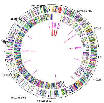
This genome map is a tool for scientist to help better track and understand an organisms genes and can provide insight into what makes it work. as well as possibly identifying which genes control what traits to better fight disease and abnormalities
This isometric city skyline map uses 3d technology to place buildings on a map that can than be viewed from a certain degree from above. You can find this type of city view in most video games and even on google earth. They provide an interesting perspective about the urban environment that is hard to display on flat maps.
http://improving-visualisation.org/vis/id=89
This word tree selects words and phrases and automatically shows selections that follow those words in a text . this can be used to spot trends and themes in a text.
http://www.fas.org/irp/imint/docs/rst/Sect15/Sect15_1.html
This thematic map of south Africa focuses on labeling regions of the country that are prone to erosion. This specific geographical area is being rated on its erosion qualities giving it that certain theme.
I choose to use this map of England and Whales with dots plotted each representing an iron age fort. This type of map visually displays the frequency in which a certain variable is present.
This proportional circle maps shows traffic fatalities in the US by increasing the size of the circle relative to the amount of deaths. For example it can be easy to conclude from the map that there were more deaths in Florida in 2009 than in Colorado.
This statistical map compares the number of abortions per state in the US. It uses colors to portray a certain number of abortions in a given range. There are many different kinds of statistical maps depending on the data you want to represent.
This is what is referred to by climbers as a topo route guide. Instead of using contour lines however it uses a 2d representation of the path needed to take along the rock in a vertical direction. It often lists distances between anchors and takes into consideration of any special gear needed for that specific route. Paired with a real picture overlay-ed with a line showing the route a climber will know exactly the way to go.